So you’ve got your marketing all up and running. You have paid search ads, your site is well optimised for mobile and you’re starting to generate traffic via organic search, you’ve got your Facebook ads working, and you’re getting lots of traffic.
People are visiting your site, but for some reason, it stays with just that: people visiting your site. You don’t see lots of conversion happening, and, to be honest, the numbers of new leads is not exciting. What could be going wrong?
Take a hard look at the individual page people are going to when the click through your ads. Do you have a good landing page? No? Then you’re essentially throwing your money down the drain.
So What is a Landing Page?
A landing page is the page a visitor arrives at on your website after clicking your advertisement. The add could be a text add in Google search or a banner ad placed on one of your social channels, just for example. If you’re just starting out in the field of marketing you might be inclined to send that traffic straight to your homepage. This is a huge mistake. Specific landing pages designed and built around what is promised on those ad banners are essential for providing a quality experience and driving conversions. If you click on an advertisement and you except one thing, but end up with something completely different… guess what? That visitor is lost. Everything on your landing page should be in line with what you promised in your ads.
“Landing pages are the new direct marketing, and everyone with a website is a direct marketer.” ~Seth Godin
Of course, like all things, it’s not just enough to check off some boxes around best practices. So what makes a great landing page? How can you create a landing page that boosts off-the-chart conversion rates? Let’s walk through the process and give you:
- Questions to ask before you get started
- The key traits of high-converting landing pages
Before You Start Building a Landing Page
So you’re ready to get to work? Sorry, before you start, you have to ask yourself a couple of questions..
- What is the goal?
What do you want your visitors to do when they land on your freshly designed page? Would you want them to buy something? Would you want them to fill out a form? Download an e-book? Sign up for a newsletter? When you’re forming any strategy, the first step is always to start determining your goals. Just like in the “Lean Startup” build-measure-learn loop, you have to define what you want before you can start tracking if you’re moving in the right direction. - Who are my competitors?
Finding out who you are competing against boils down to three simple questions: Who are my competitors, how are they succeeding, and how can I copy their success 😉 There are almost always going to be people who are a step further than you are… people who are getting successful conversions on their website. Imitation is the sincerest form of flattery, so check what they are doing, and then learn from them, and adapt their success to your situation. - Who is my audience?
We already spent two earlier articles discussing buyer personas. Time to refresh that memory! Who is the person visiting your landing page? What is their background? What are their goals and dreams? Their problems and needs? Their behaviour? The better you understand your audience, the more you can tailor your landing page to their needs and wants. So get those personas out again! - How will they be arriving on my landing page?
People clicking on a banner on LinkedIn will have a completely different mindset and goal than visitors coming from Facebook or Twitter, for example. Consider changing the message you’re displaying on your landing page based on where the visitor is coming from.
Businesses with more landing pages generate more leads than those with only one or two. Ideally you would have a specific landing page, for each different group you’re targeting with your ads. If you’re starting out, that’s a LOT of work, though, so start small. Try beginning with one custom landing page per campaign. Learn from them, tweak them and slowly increase.
How To Make Great Landing Pages That Convert
Now that we know a lot of important details like what we want to get out of our landing page, how our competitors are doing, and where our audience is coming from, let’s see how you can make that amazing landing page convert.
1. An Effective Landing Page Keeps it Consistent
There should be consistency between the banner that your potential customers clicked on, your landing page, and your entire website. If these elements don’t work together, it’ll confuse your visitors. Keep the message consistent by repeating key words and slogans on all elements, and using the same tone and type of language throughout. This will reassure visitors that they’ve come to the right place.
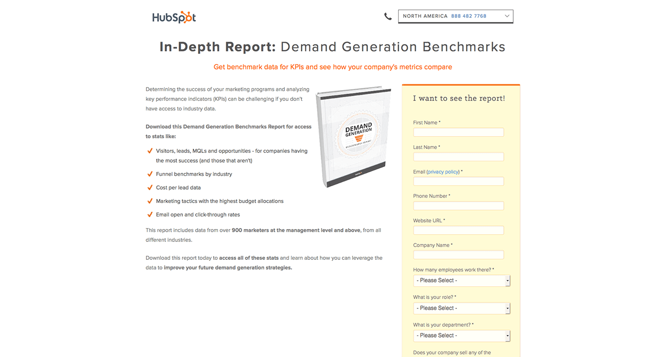
An Effective Landing Page Keeps it Consistent – Hubspot using same colours and styles on all their pages
2. An Effective Landing Page Grabs Your Visitor’s Attention
You’ll only get a couple of seconds to grab the visitor’s attention. That’s where a well crafted “Unique Value Proposition” (or UVP) comes in. According to Steve Blank, a UVP is a single, clear and compelling message that states why your product is different and worth buying. Or in other words, the minimum of what you want your visitors to understand. After only a couple of seconds on your landing page, it should be clear what’s in it for them.
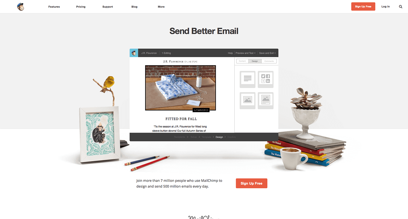
An Effective Landing Page Grabs Your Visitors Attention – MailChimp has a clear UVP
A surefire way to capture attention is to talk about what every visitor cares the most: himself and his problems. What will he get from you and how will that benefit him? How are you unique, or better from all the other websites that your visitor has seen throughout the day. You need to communicate all of this to them, and quickly. That’s the goal of your UVP.
3. An Effective Landing Page Communicates in a Clear and Simple Way
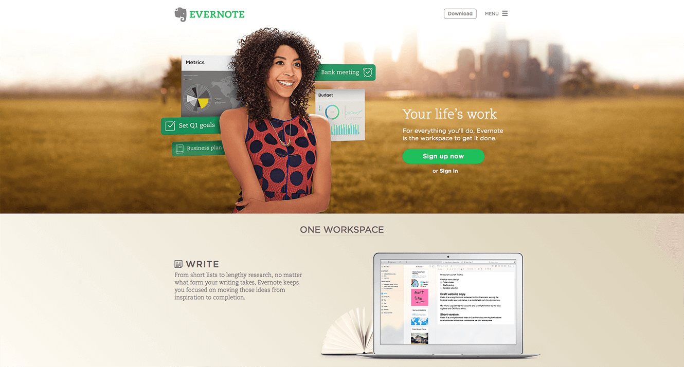
An Effective Landing Page communicates in a Clear and Simple Way – Evernote explaining clearly what they do
Your goal is to capture their interest, so they’ll read on. Explain what your website / product is, using clear, simple and unambiguous language. Don’t use meaningless adjectives – especially superlatives (“revolutionary”, “unique”, “innovative”). Neil Patel aims to write as a fifth-grader. Look at the Evernote example above. Everything is clear and understood within seconds.
4. An Effective Landing Page Calls the Visitor to Perform an Action
In a famous scene from Glengarry Glen Ross, the man sent to train the hapless salesmen sums up his sales mantra – ABC: Always Be Closing. This should be the mantra of your landing page, too. And the way you accomplish ABC is by focusing on your call to action.
[youtube https://www.youtube.com/watch?v=v9XW6P0tiVc]
The call to action (CTA) is what you want visitors to do: Shop Now. Sign Up. Try It. Contact Us. See Our Video. Whatever it is you’ve decided will move people further along your conversion funnel. That’s what you should be asking them, clearly and temptingly, to do. Don’t distract them with lots of other requests. The best landing pages only have one CTA
5. An Effective Landing Page Builds Trust and Credibility
The internet can be a dangerous place. Why would the visitor trust you by leaving his email address, or even his creditcard information, with you? People buy from people. People they trust. So you need to build that trust.A landing page’s testimonials are one of its most important trust signals. A user wants to know that they can trust the product or service. If they see a trustworthy testimonial, this goes a long way in cultivating the user’s trust.
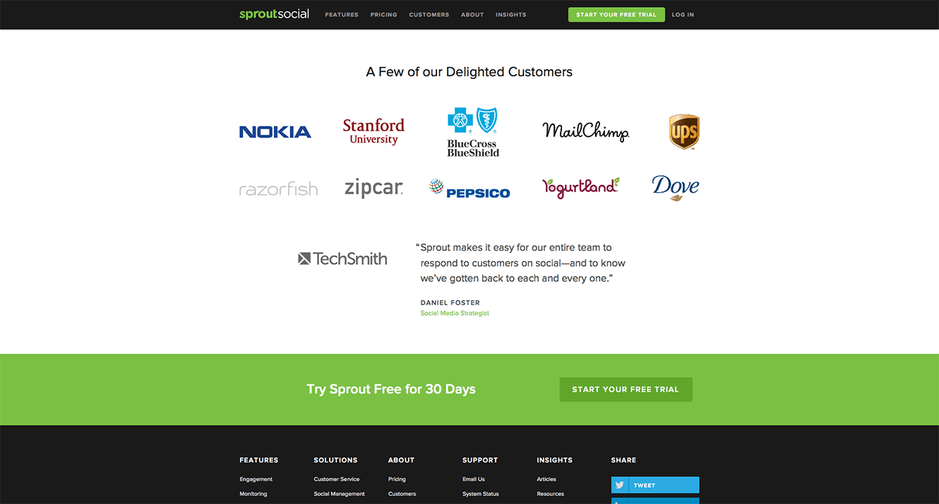
An Effective Landing Page Builds Trust and Credibility – Sprout Social creating social proof by highlighting some customers
Other ways to build trust can be thing like social proof (“as seen on..”, “used by..”), or social media proof (“XYZ have shared this page on Twitter”, or “XYZ people like us on Facebook), or different ways of contacting you. Are you legit? Then prove it! Some of the most persuasive landing pages that have multiple methods of contacts — a phone number, a physical address, an email address, and a contact form. Some even have popups where a customer service representative asks if they can be of help.
6. An Effective Landing Page Keeps Information Gathering to a Minimum
Visitors become suspicious when they need to supply a lot of information to take advantage of a special offer or enter a competition. They value their privacy and worry about how their details will be used by your company and third-parties. These concerns may even compel some potential customers to leave your landing page.
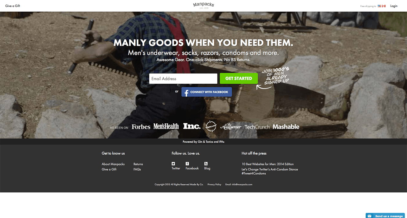
An Effective Landing Page Keeps Information Gathering to a Minimum – Manpacks is only asking for an email address
You get around this by only gathering the details that you really need. Just because you can add an extra field, doesn’t mean that you should!. It’s also helpful to add a disclaimer like “We’ll never sell your email address”, along with a link to a more comprehensive company privacy policy.
7. An Effective Landing Page Gives Some To Get Some
Just as humans are pain-avoiding machines, we are also pleasure-seeking animals. Every human is motivated by the desire to gain pleasure, which can have a variety of forms.
Landing pages are often built to convert visitors into leads. Most of the times this happens by calling the visitor to subscribe to the company’s email newsletters. Why not give your visitor a “free bribe” (e.g. a link to a webinar, or a link to download a white paper) in exchange for their email address?
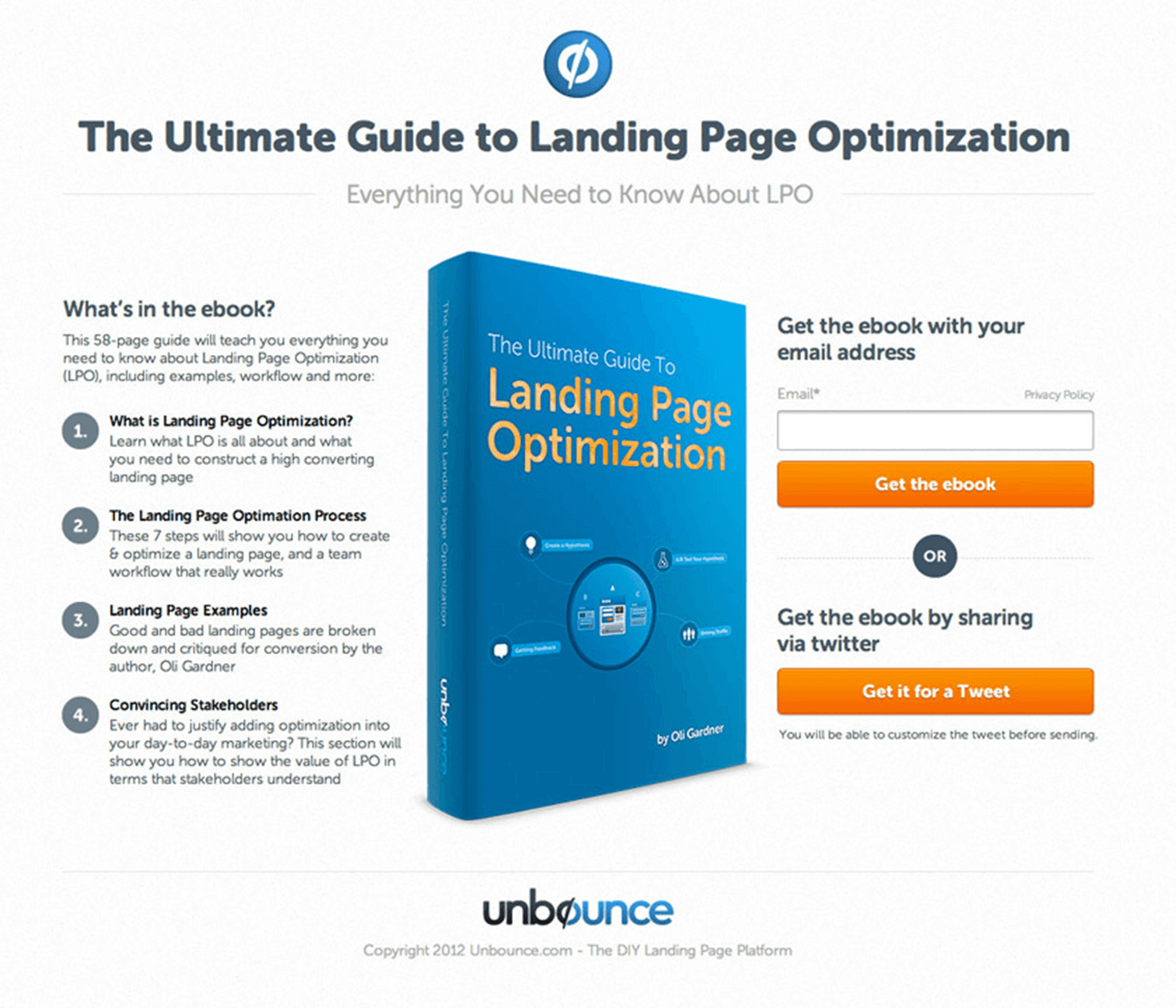
An Effective Landing Page Gives Some To Get Some – Unbounce giving away an ebook in exchange for some basic information
Providing free content is usually a part of a broader content marketing strategy. A face-to-face sales rep will often have to visit their customer several times before the customer is ready to sign. A good salesperson knows the importance of the relationship they build with their customers. Signing people up for a newsletter or an e-mail course, and then delivering high quality content on a regular basis can help you build this relationship in the faceless context of the Internet.
And once they land on your page after consuming such high quality content for a while, they’re not anymore a cold lead!
8. An Effective Landing Page Follows Up With a Thank You Page
The thank-you page is a great way to guide visitors to other related material on your website that they may be interested in. Providing this added info in the initial landing page would have been distracting and could have led visitors away from making a conversion. However, now that you’ve sealed the deal, the thank-you page is the perfect place to exceed expectations (surprise people with a bonus offer or extra content download), suggest related products, guides and information your audience may find helpful, or links to other parts of your site, such as your company blog.
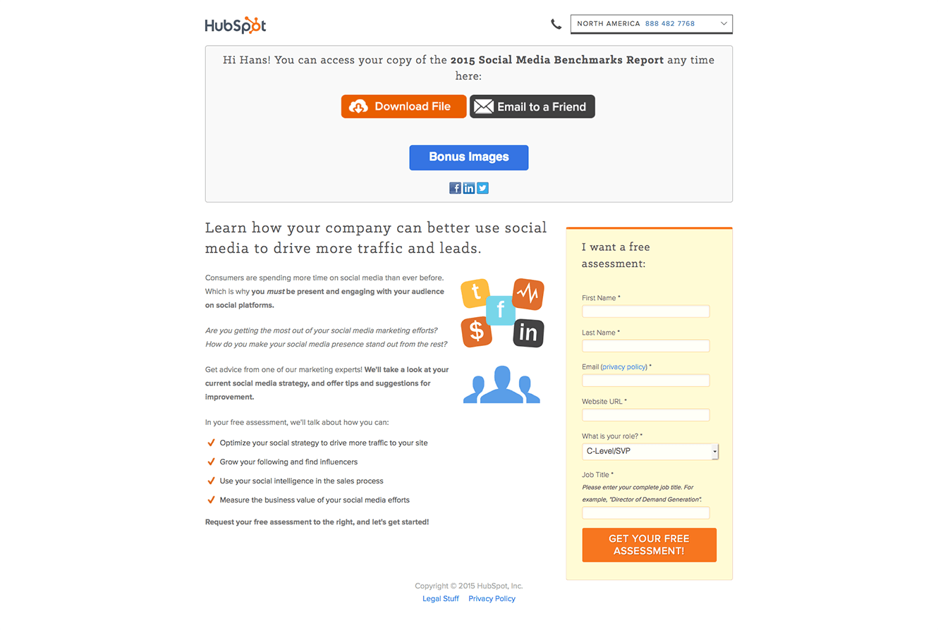
An Effective Landing Page Follows Up With a Thank You Page – HubSpot follows up with a great thank you page, trying to get you further along the funnel
9. An Effective Landing Page Provides Convincing Information You Need To Make a Decision
Landing pages are sometimes sales pages, meant to convert a lead into a paying customer. They have one of the most difficult jobs – convincing people to part with their hard earned cash.
How can you throw in some tactics to make it an effective sales page? Try pointing out everything they are getting for the price, right next to the CTA. Or make it an extra great deal by throwing in some bonus, rebates, etc. Lastly you can try adding in a sense of urgency (think of things like “for a limited time only”, “limited seats available”, “X people are viewing this deal right now”).
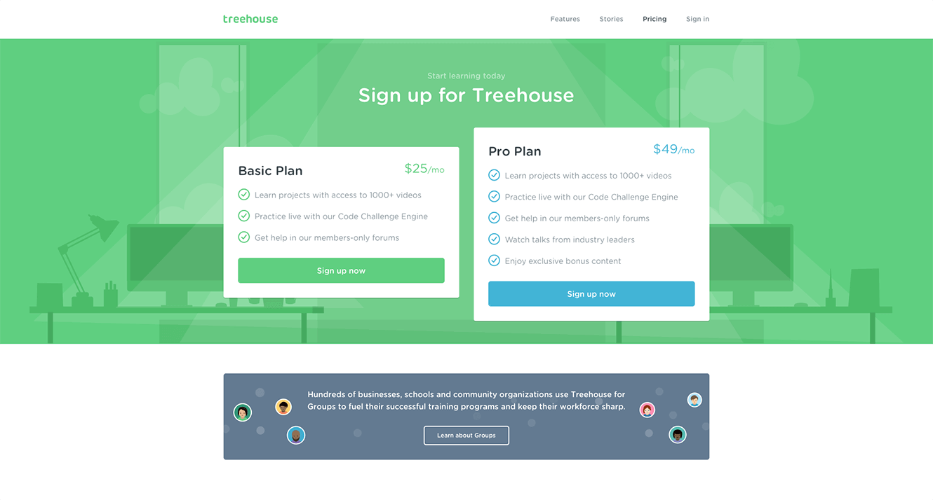
An Effective Landing Page Provides Convincing Information You Need To Make a Decision – Treehouse offering a clear pricing scheme
So that’s it. A landing page is the place where all your efforts come to fruition. This is the place where customers click, people buy, and you make revenue.
Don’t screw it up.
Implement each of those 9 steps and you’ll create a powerful and high-converting landing page. And once you’re done, learn from them, maybe do some A/B testing, and keep improving. The process of creating a landing page is never finished. There’s always more room to grow.
What do you consider to be some of the absolutely essential elements of a high-converting landing page?

