We all understand the ongoing struggles startups have to increase user signups on their websites. When looking at the big boys and girls out there, it might look so easy! But don’t forget they by now have lots of resources and already have a big coverage, resulting in a big advantage when it comes to converting landing page visitors to sign up for their product.
But all of these startups had to start somewhere. They all started out just like you and me, with just a simple landing page trying to convert visitors into believing their vision of whatever it was they were building.
In the past week, we’ve had the wonderful opportunity to talk to some of our heroes in the marketing and startup markets. Hopefully, you’ll be able to learn as much from them as we’ve learned here at Inbound Rocket.
The basis for our conversation was the blog post “How to make great landing pages (with crazy high conversions)” and the simple question I had around this process.
If you are just starting out with your company, nobody ever heard of you or your product yet, your product might not even be finished yet, how do you convince people on your landing page to sign up? Things like social proof to make a stronger case for whatever it is you are building are non-existent yet for example. So what are the key treats for you as a founder to include on your startups landing page?
It might not be the most hard-hitting question that we could ask them, but we believe it is a vital question nonetheless. As you know a landing page is not about adding more and more information to hit that visitor with, it needs to be clean and clear within seconds. So maybe the question could be rephrased to “If nobody has ever heard of you or your startup yet, how would your landing page look like to convince users to signup..”
This is who they are, ranging from Marc Köhlbrugge (Betalist) to Oli Gardner (Unbounce) and all the brilliant minds in between. Oh and this is what they answered..
Marc Köhlbrugge

Who? Marc Köhlbrugge is the founder of BetaList, a website that helps early adopters discover tomorrow’s startups, today. Since its launch four years, BetaList has featured close to 5,000 pre-launch landing pages including those from startups like Pinterest and Mailbox.
Where can I find more information about him? https://twitter.com/marckohlbrugge – http://betalist.com/
His advice: Make use of the AIDA model. Attention. Interest. Desire. Action. Use an intriguing image or screenshot with a great headline that grabs people’s attention. One sentence that makes them stop and look. Now you’ve got their attention get them interested. Explain how your product will make their lives better. Don’t describe your product features, tell them how their life, whether it’s personal or professional, gets better if they use your product.
Even if you have a B2B business you’re still targeting a person within that business, not the business itself. It’s a human being that is visiting your website.
Once they are interested, convince them your product will satisfy their needs. Convince them they should subscribe to your mailing list. Offer them a discount or convince them otherwise why they should sign up right now. Lastly, make it very easy for them to sign up to your list. The signup form should be front and center. Don’t hide it on another page. Don’t ask for information you don’t need. The email address should be enough. Once you have that you can always contact them to request additional information.
Another way to look at it is this: Answer these questions:
- What are you?
- Why should I care?
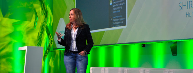
Shira Abel

Who? Shira Abel is the CEO and lead strategist of Hunter & Bard, a marketing agency that works with startups and intrapreneurs – focused on branding and behavioral engineering to build brand awareness. Shira works with companies to build and implement smart marketing strategies and build online communities that grow companies. Next to all of this, she recently started out as a mentor for 500 startups.
Where can I find more information about her? https://twitter.com/shiraabel – http://hunterandbard.com
Her advice: No budget, no one knows who you are, and no one cares. You throw your landing page into the universe and all you’ve heard back is crickets. And while you might like the sound of crickets, that wasn’t the roaring thunder of success from the crowd you were expecting when you launched your coming soon page.
So what to do?
- Show a screenshot of your product. This has to be the sexiest, most interesting shot you could possibly put publicly while still being safe for work.
- People. Photo background of people who look like the people who will use your product. SaaS that helps IT people – the background folks better look like people you know in IT. Something aimed at the parent market? Have some moms, dads and kids on there. We subconsciously look for social proof of products by looking for people who look like us. Before I pay for a service I look at the team page, if I don’t see a woman I vote with my wallet. We all do.
- Great description. What do you do? Why do people care? How do I as a customer benefit? State it clearly. Make sure I can’t live without you. Tell me your story.
- CALL TO ACTION – Tell people what you want them to do. ONLY ONE THING. Do you want them to sign up for your launch? Ask them to sign up for your launch. Want them to share? Ask them to share. Want them to sign up and then share? Don’t ask for both at the same time because people will leave. First get them to sign up, then on the after page ask them to share. One thing at a time.
- Scarcity – Tell them that you’re only allowing a limited amount of people into your Beta. People will be clamoring to get in.
There are more, but this will give you a wonderful start.
Sujan Patel

Who? Entrepreneur & Marketer. VP of Marketing at When I Work. Co-founder of Content Marketer. Contributor at Forbes, Entrepreneur, Inc, and the Wall Street Journal. Skydiver and thrill seeker
Where can I find more information about him? https://twitter.com/sujanpatel – https://contentmarketer.io
His advice: There are a few things you need on your landing page in order to make it compelling enough for visitors to stick around and eventually decide to convert. First, you need to emphasize the pain point your product or service is addressing right away in the headline. Second, you need to explain your solution clearly in no more than 3 steps. Ideally, you’ll also have screenshots for each step in the process that illustrates even further how simple your product or service is to use. Third, you need to include some social proof statements. This could be numerical (such as number of downloads or number of customers), or it could be something more qualitative (like a testimonial). I usually prefer to use testimonials because they tend to connect with people on an emotional level. People can relate to words and feelings from another person faster or better than they can relate to impressive numbers. Fourth, you need to include a brief list of FAQs at the bottom of your page. FAQs can help address any objections your visitors might have when they are deciding whether or not to convert. Finally and perhaps most importantly, you landing page must include a crystal clear call-to-action statement somewhere above the fold. This usually comes in the form of a button with a word or phrase incorporated into it (like “Buy Now” or “Give It a Try”).
Bonus ProTip: Remove all distractions from your landing page. Make it as clean and simple as you can while still providing all the information a visitor needs in order to trust you enough to make the decision to convert. Don’t use flashy animations or worthless stock photos. Just get to the point.
Dan Norris

Who? Dan Norris is a serial entrepreneur, award winning content marketer and the author of the best selling business book The 7 Day Startup. Dan is a passionate content marketer and has created thousands of pieces of content around entrepreneurship, Startups, WordPress and online marketing. In 2013 he was voted Australia’s best small business blogger by the readers of Telstra’s Smarter Business Ideas magazine. In 2014 Dan released The 7 Day Startup which became a top 10 bestseller in 3 Amazon categories and is still the #2 startup book on Amazon.
Where can I find more information about him? https://twitter.com/thedannorris – http://wpcurve.com/the-7-day-startup/
His advice: Although social proof seems hard, there are ways you can easily build social proof gradually over time. Here are a few ways I’ve done it.
- Done free work in return for a testimonial
- Put things like ‘Started by entrepreneurs featured in….’ and then list logos like Forbes Inc etc. I’ve been featured in these places so it’s reasonable.
- Write a press release and push to get featured in local tech news sites. We did this with Helloify and we have 4 logos up at http://helloify.com on launch date. Product Hunt is another one that’s easy to get on.
Another good factor to build more trust on your website is by having a great design. If your design is good then people will trust the site more and it looks less like something thrown together.
Bram Kanstein

Who? Bram Kanstein, the creator of startupstash.com, which is the #1 most upvoted product of all time on Product Hunt!
Where can I find more information about him? https://twitter.com/bramk – http://startupstash.com
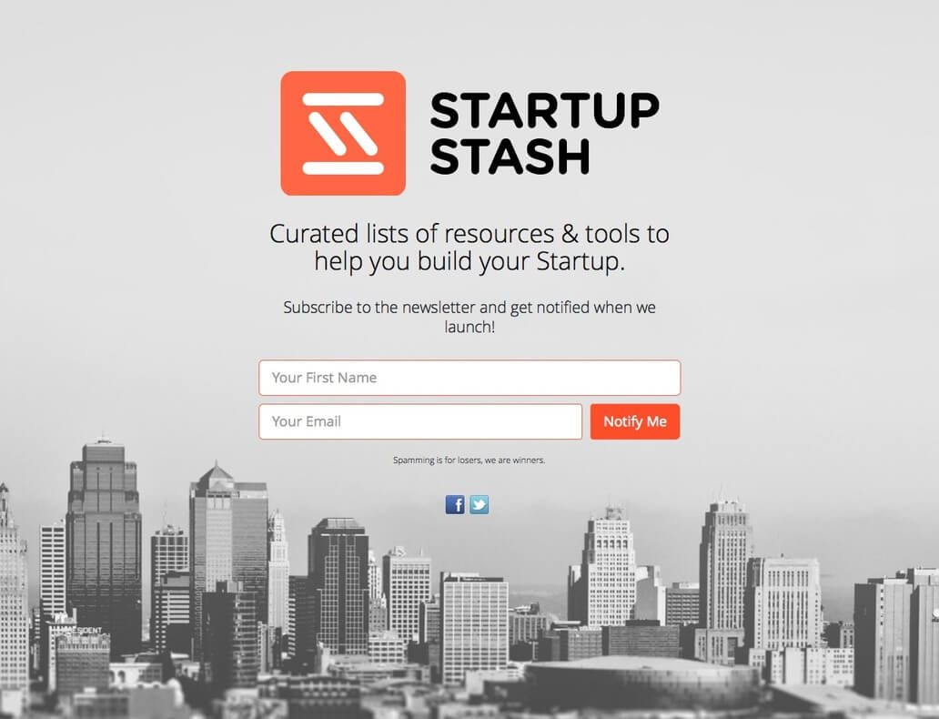
His advice: I started thinking about putting up a lander because I wanted to see if I could find some people who were interested in my idea via Betalist. The idea was clear to me, but now I had to think of a tagline! Very difficult, and it took me some time to come up with the right one: “Curated lists of resources & tools to help you build your startup.”, I thought it was short, simple, and made clear what the purpose of the site was going to be. I checked out some other landing pages and added the CTA: “Subscribe to the newsletter and get notified when we launch!”. Pretty standard but also straight forward. To add a little touch I added “Spamming is for losers, we are winners.”, my idea was that this showed some character instead of a standard “We will never spam you” message. I didn’t want to have a one colour background so I chose to use a black and white image of a city. I do have to admit, chosing that picture was pretty random, just because I liked it 😉
When I’d set up the first version of the lander I just let it sit for a few days, changed some CSS and made sure it got featured on Betalist.

StartupStah on Betalist: http://betalist.com/startups/startup-stash
It worked! I had around 600 subscribers after one week! You can read what I did with the subscribers and the rest of my story here: http://medium.com/@bramk/how-i-launched-the-2-most-upvoted-product-of-all-time-on-product-hunt-f3772fb20ad8
Adam Rotman

Who? Adam is the co-founder of Share As Image and loves to build amazing products that help companies succeed. Share As Image is the fastest way to double your social engagement. It helps you turn images or text into viral, eye-catching micro-content that you can share in seconds.
Where can I find more information about him? https://twitter.com/adamrotman – https://shareasimage.com/
His advice: It’s pretty important to have a page that’s at least somewhat visually appealing (creates some trust) and presents your message clearly. Essentially, that means not using a stock Twitter Bootstrap example template without making any adjustments. Spend a bit of time choosing some fonts, colours and use some royalty-free images where possible. At this stage, since you don’t have any social proof yet, it’s all about clearly explaining what your offering is and how it’s going to help your prospective user (or customer).
We’ve tried various approaches, but at first, we really just gave users access to our product in a single click. If possible, the trick is to distil your messaging down to almost a single call-to-action that allows users to get signed up with the least friction. If you’re offering a “no credit card” free trial option, for example, definitely draw some attention to that so you can have users know in advance that it’ll be easy to get signed up and that they don’t really need to commit to anything.
Oli Gardner

Who? Oli has seen more landing pages than anyone on the planet. He coined the term Conversion Centered Design, and speaks internationally on the subject. At Unbounce, he lives in front of a 20ft whiteboard, mashing up landing page optimization to create better conversion experiences. His disdain for marketers that send PPC traffic to a homepage is legendary.
Where can I find more information about him? https://twitter.com/oligardner – http://unbounce.com/
His advice: In short, I don’t think you can convince people outside of the validity of your product, and the relevance of your visitors.
My only real point of reference is that when you are starting out, you must create content that helps your prospective customers. If you can help them through content they’ll start to develop trust in your product by proxy.
It’s not about social proof or landing page structure, it’s about offering something of value.
If you need to focus entirely on a signup (not content marketing), then yes social proof becomes more relevant. If you don’t have a customer to give a testimonial, then you should spend 99% of your time doing outreach to find bloggers, and tech news platforms and get your product in their face. Find influencers in your target market and give it away for free, asking only for feedback. Getting feedback lets you get into a conversation which will benefit your product. It also creates a relationship that you can come back to with a new feature that turns that influencer into someone who would offer a testimonial or talk about you.
Connect to startups who might benefit. They will hack your shit and find ways to make it help them if it’s relevant.
It’s very hard starting out, but for me, the best thing you can do is start creating genuinely helpful and entertaining content that supports the goals of your target audience, and make that your mission. If you don’t know how to write, learn how to write. Write 500 words every day before you start work, about anything. You’ll pick it up.
Like what these experts have to say? What did you at your startup which turned to be a huge success? Let us know what you think or what worked out really great for you in the comments!

