
It can happen to the best of us, you’re spending lots of money buying ads, you’ve designed and optimised your ads so the get lots of clicks, but there are no conversions. You double checked again to make sure the links are not dead in the ad, and they are coming to your site.
So why aren’t they converting?
According to research done by MarketingSherpa, 44% of B2B clicks are directed to a home page, instead of a dedicated landing page. So where are you sending your traffic? Sending ad traffic to a dedicated landing page helps to improve your page relevance (which is an essential ingredient of your Quality Score, the single biggest factor in determining your ad results and costs).
Sending (paid) traffic to unoptimized landing pages is a big waste of time.
A landing page is a standalone page designed for one specific objective. Or at least it should be. In reality, even if you sent your traffic to a dedicated landing page, they ask their visitors for too many different things. Everything is shouting for attention. And with all these things screaming for attention, visitors tend to leave.
For you as a small business owner or a startup, every dollar wasted is a dollar you can’t spend growing your company. So what are the most common mistakes made on landing pages and what can you do to make sure you don’t make them?
In this article, we go through the ten most made mistakes and show you what you can about them.
Landing Page Mistake #1. Slow Page Speed
We can start talking about all the things that might be wrong with your landing page, like point two, too many distractions, etc. But that would mean that people first need to see your landing page.
If your landing page doesn’t load with five seconds, 74% of your visitors are already dropping off before they could even get distracted by all of the other points.
For eCommerce sites, this is even worse. Having a three-second load time? Half your traffic is already gone. That is the reason why the best brand in the world first focuses on reducing their load time. Their load time is below one second and so should yours be.
So how can you check and improve your loading speed? First off you need to check your current speed. Tools like Pingdom or Google’s PageSpeed Insights will give you a quick idea how you’re currently doing and what specific items could be optimised.
Most of the times there are a couple of things slowing down the loading speed of your website, which is easily fixable:
- Cleaning up your code, removing extra’s that you don’t need. Minifying your JavaScript and CSS files etc.
- Minimising redirects where possible
- Just like your the previous two steps, a lot of people forget to optimise their visuals and run them through tools like TinyPNG, etc. to reduce the file size
- If all of the above three items still don’t make a dent in the universe, it might be time to upgrade your hosting as well
Landing Page Mistake #2. Too Many Distractions
A lot of people are in the belief that a user should have a choice. That more choice is better, however in the case of a landing page where there is only one specific objective, having a choice is bad.
We live in an attention economy, and too many choices kill the ability to make a decision.
Every extra element you add to your page decreases the importance of everything else on your page. By minimising distractions, you increase the attention towards the most important items. This means the navigation bar should be gone, links in the footer should not be there, etc., etc.
For example, in 2009 the landing page of Twitter was asking for seven different actions:
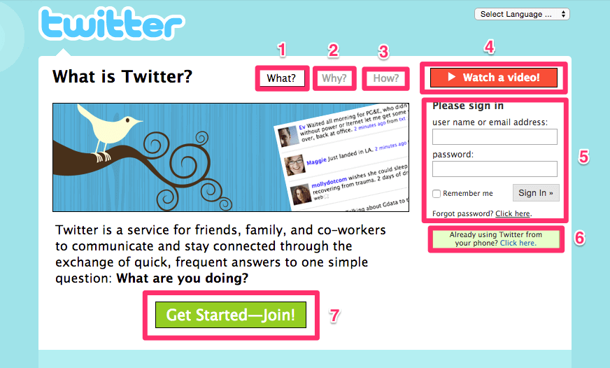
And even though they could point to all these things on their homepage to try people to convince to use Twitter. The purpose of that page should only be two things. Either you sign-up or you sign-in. All the rest, like links to their USP’s, etc. were taking people away from those two goals.
If you compare that to what their homepage looks like right now, you can see the difference.
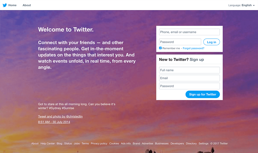
The Twitter homepage in 2017, focusing on the two most important items: sign-in or sign-up.
They’ve removed every extra element that could be distraction their visitors. Focusing on the two most important things. Think of it like this. When you arrive at a page like this, most people’s reaction would be “What am I supposed to look at here?”.
You need to get rid of any visual distraction that would prevent someone from taking the action you want them to take on your landing page if you want it to be successful.
Landing Page Mistake #3. No Unique Selling Proposition (USP) or Value Proposition
When all distractions are removed your landing page, the first thing a visitor should see is the most important sales point you have. Why would someone want to buy your product or sign-up for your product or mailing list?
Your Unique Selling Proposition (USP), or Value Proposition should communicate in a clear and firm voice what makes you so special. Depending on the goal of the landing page, this could be the product you’re pushing, the promotion you’re offering or some statistics that make your business so unique that the visitors can’t help themselves to sign-up.
People sometimes make the mistake of confusing their USP with their Call-To-Actions (CTA). To make it easy to remember, your USP is your primary and unique selling point, while your CTA turns the interest generated from this USP into the action you want them to take.
[clicktotweet]Price is what you pay, and value is what you get.[/clicktotweet]
Some examples you can use on your landing page:
- The easiest way to [product or business purpose]
- The #1 provider of [service]
- [Well-known-brand] gives you [thing], we give you [better thing]
- Get [your service] Free for [length of trial]!
Landing Page Mistake #4. Copy That Doesn’t Match Your Offer
Everything you write on your landing page from the Value Proposition to the body copy needs to be in line with the offering your giving and the ad copy that led people to your landing page in the first place.
When someone sees an ad for something and the landing page they land on is talking about something completely different they are gone before you know it. The copy of both USP and the body copy on the page needs to be relevant to the user because that is the only way you can keep their attention and make them complete the action.
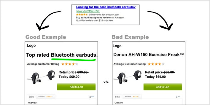
Image source: Instapage
Look at the above picture, for example, the copy on the left is better than the copy on the right, because of the copy on the right repeats that “top rated Bluetooth earbuds” again, compared to just some generic product title on the right. Where are the earbuds that I just saw in the ad?
Landing Page Mistake #5. Not Having a Preview of the Item and Other Visual Mistakes
We’re living in a visual society, so why don’t you take full advantages of them on your landing page? There’s a lot of reasons why the visuals on your landing pages are hurting your conversions; let’s have a look at them:
- Irrelevant images – Almost a bit the same as your copy not matching your offering. The same problem can happen when using a wrong hero shot, a visual representation of your offer that demonstrates how your product or service works so your prospects can picture themselves using it. If you’ve created an ebook and have a landing page set-up for that, use a picture of the ebook to give people an idea of what they are getting. Any other images won’t be bringing any value and will only distract
- No images – Almost as bad as having a wrong image, is having no image at all. An image can help and support the value proposition that you’re trying to communicate. Make sure that the visual you offer stands out on your page and communicates your content clearly though.
Landing Page Mistake #6. Not Optimising Landing Pages for Search
Just like writing and optimising your normal website copy for SEOwriting and optimising your normal website copy for SEO, you should also do this same practice for writing the content for your landing page. Especially if you’re a small company with not a lot of budget to spend on ad campaigns, you need your landing pages to be shown up in organic search results.
Be sure to do keyword research before writing your headlines, sub head lines and product descriptions. Otherwise, you might have a perfectly good converting landing page, but it only converts as long as you keep putting money behind it. If no one search for the content on your landing page it will never rank.
For example, you could make a page by mistake that the title tag, H1 heading and image alt tag information optimised for just the keyword “playbook” when that is too general, and you will never rank for the keyword “Social Media Playbook”.
If you want to optimise your landing pages for SEO be sure to:
- Use the model numbers of product title in your title tags and H1 headings
- Use brand names in your title tags and H1 headings
- Don’t forget to include an image alt tag information
- Don’t keyword stuff the page, but just repeating it over and over again (never a good idea)
- And never, ever use iframes to showcase the content of your landing page. Make sure that the content on the landing page is there.
Landing Page Mistake #7. No, or uninspiring Social Proof
A lot of marketers make the mistake of creating a landing page without any social proof. Social proof, or endorsements by others, however, can showcase a strong reputation, it shows that your trustworthy and as a result can increase the conversion on your landing pages.
Reviews need to be actual quotes from real, relatable customers, celebrities or influencers that have used your product or service. Showing real people with their name, function and profile picture, makes your page seem friendlier and can help showcase your product in a way that is hard to achieve by just your copy. Of course, the better known a person is, the better the social proof.
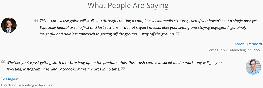
Examples of great social proof that do wonders for your conversion.
Take a look for example at the social proof on our landing page for our social media playbook, why do these testimonials work so well?
- The include the full name, and picture of real people who read and got value from our playbook, as well as the position and company they work for, or any awards they got, proving their credibility
- They are relatable to traffic arriving at that particular landing page because they are well known in the industry
Social proof shows the value of the product or service you’re trying to offer on your landing page and can have a strong influence on your conversion rate. By including them on your landing page, you show credibility making potential leads more at ease into trusting your business.
Landing Page Mistake #8. Poor Mobile Experience
In May 2015, Google mobile searches surpassed desktop searches. This is a trend, and it’s not going away. 80% of Facebook’s Advertising Revenue can be attributed to mobile.
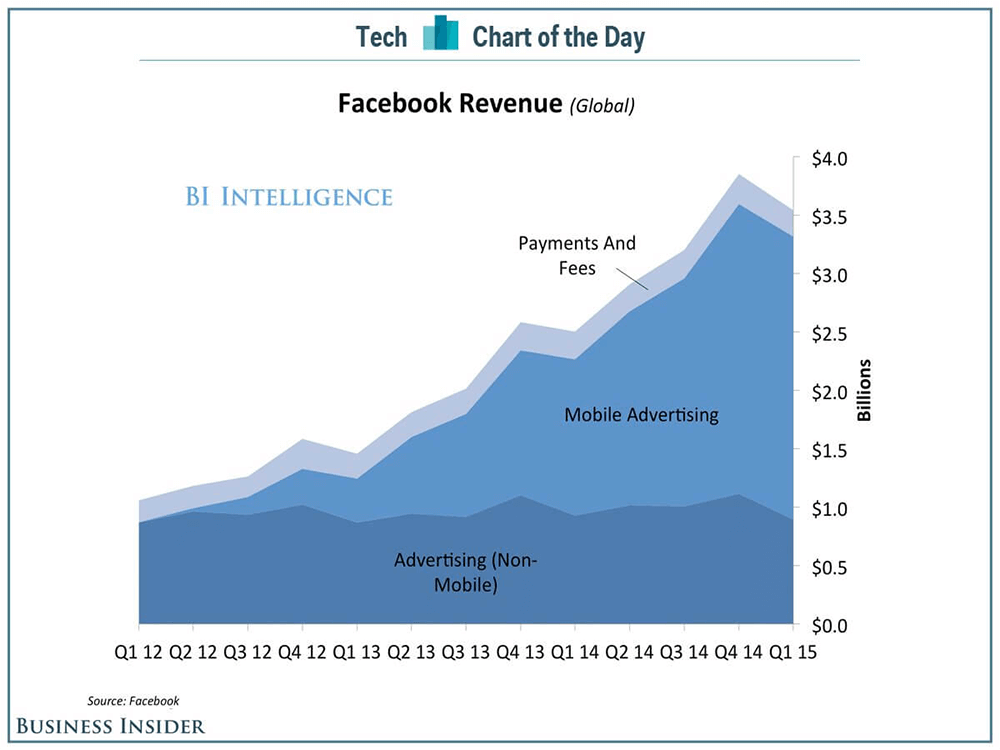
Image Source: Business Insider
There is a high probability that over 50% of the visitors to your landing page are arriving there on some mobile device. If your landing page is not optimised for the mobile experience, your losing money and credibility.
Next, to that mobile visitors have a different intent and high distraction levels and expectations that are not always inline with people viewing your landing page on desktop.
[clicktotweet]Everything you do online, make sure it looks amazing on mobile first.[/clicktotweet]
To get the most out of your landing page on mobile ensure that it is not to there is not to much text and that the text that is on your landing page is clearly readable. The average width of an adult thumb is 1 inch, which converts to 72 pixels. Make sure that your Call-To-Actions are big enough for easy click using your thumb.
Landing Page Mistake #9. Your call-to-actions are confusing people
Call To Actions (CTA’s). The lifeblood of any organisation. After all, what good does it do for your company, when someone pays a visit to your landing page and leaves again?
A lot of marketers love CTA’s so much that they try to add multiple of them on a landing page. The logic being, if a visitor doesn’t like your primary CTA, there is always another one right?
But as we already showed in mistake number two, too many distractions can hurt your conversions. The best practice is to only place one single CTA on your landing page.
Try playing with the copy, colours, and urgency on your CTA’s to find the perfect mix for your landing page:
- Use an action verb (get, do, try, start)
- Use “You” instead of “My” (Start your free trial)
- Be specific about what they’ll get (Get your 14-day free trial)
Landing Page Mistake #10. You’re Asking For Too Much
If you a brick and mortar store and a someone walked in, potentially wanting to buy from you. Would you ask where they live, how many family members they have and maybe if you can hold their credit card while they browse through your store? Probably not.
Or maybe when you’re in a bar, and a total stranger walked up to you asking for your phone number? Would that work? Okay there might be a slim change for that one, but you get the point 😉
Why wouldn’t these examples work though? Because there is no trusting relationship yet, you’ve never met before, and you’re immediately asking for all sorts of private details.
The same thing goes for a lot of forms on landing pages.
You’ve just fixed all of the above and your potential lead is ready to fill in the form, but then… your form is way to complicated.
And of course, for your business, you want to have as much information as possible so you can properly qualify your leads. But for a visitor, they want to get your product, your ebook or whatever other it is that your offering as quickly and easily as possible.
Even one or two extra fields can drastically decrease the conversion rate of your landing page according to research done by Hubspot.
So what to do? Try to find a trade-off; maybe there are some form fields like a location you can already automatically pre-fill. Or maybe ask only a name and email address the first time, and the second time when someone comes back asking for a little bit more details.
A lot of companies are asking way more information on a form than they need. At a basic level, you need an email address and maybe a name. The rest you can obtain later. Before adding any extra field on your form ask yourself this question: is this information necessary to complete the current transaction? If not leave it out.
There you go, the ten biggest mistakes you could be making on your landing pages that are killing your conversions. And now you know, there is no excuse anymore to keep on making them on your landing pages.
Time for you to take a critical look at your current landing pages using the above tips. Time to get those conversions up and improve your business results.
Did we leave anything out? What mistakes do you see on your pages and what did you do to fix them? Leave a comment below!

