Call To Actions. The lifeblood of any piece of content marketing for your organisation. After all, what good does it do for your company, when someone consumes your content and leaves again? Leaving, without giving anything in return, so there is no way to contact them again in the future.
Getting visitors on your website to do what you want is one of the missions you have as a marketer. In reality though, visitors abandon shopping carts before checking out, they don’t sign up for your well thought of newsletter, some of them don’t even have the common courtesy to consume your content all the way to the end!
There is however a way to get your prospects to do what you want, all you have to do is create and include powerful call-to-actions on your website and in your marketing campaigns spread over social, email, etc. Simple, right?
Well, Call-To-Actions can be a bit harder then they sound. In this article, however, we’re deep diving into them so you can make the most out of it for your company.
What is a Call-To-Action
A Call-To-Action (CTA) mostly come in the form of buttons on your landing pages and sales pages. They are designed to prompt an immediate response, encourage a sale or any other goal you set up for your page. Most of the time it is part of the landing or sales page, however it can also be included throughout content pieces or at the end of a piece of content.
CTA buttons can vary in style and size depending on the goal you want to achieve and the style guides of your website of course.
The goal of any great CTA is to create a sense of urgency. The sooner you can inspire your visitors to take action the more urged they are to do so.
Some typical examples of CTA buttons are:
- Add to cart buttons
- Free trial sign-up buttons
- Download buttons
- Newsletter subscription buttons
When creating these buttons, it is easy to lose your focus on the goal you’re trying to achieve. As a result, your buttons aren’t converting because the CTA is too weak with no sense of urgency. So how can you make them as actionable as possible? Let’s have a look.
What makes a good call to action?
This is a tough question to answer for each business. Why? Because there is no straight right or way to approach the creation of CTA buttons. Not all companies are created equal, and as a result, not all website are created equal. What works for one company does not have to work for you.
As a result have a look at the list of items to consider, to start building your tests. Always test different CTA’s, see what things work best for your website and your target audience. If it starts converting better than another version you tested before start using that one.
That said, if you want to increase your changes of success, some elements are considered best practices to start testing on your website.
Colour of your CTA
The first item we want to draw your attention to is the colour of your buttons. Colours matter, they matter a lot. If you can only start testing one thing, our suggestion is to start with the colours of your buttons.
According to research by ConversionXL, green and orange buttons convert the best. In the end, though it all depends on your site design.
Green and orange buttons might convert best, but if your website is green or orange they won’t stand out from the rest of your content, and they still would not convert. Make sure that your buttons are in a contrasting colour, so they stand out.
If you’re not sure what looks best, try running a squint test and see what comes off as most appealing to your audience. You can also get inspired by this colour psychology infographic from KissMestrics, to see which colours inspire which type of emotions.
Wording on the button
Now that you’ve got a button that stands out from the rest of your content, it’s time to look at the text on the button. Just like when creating a headline, you should create an actionable piece of writing. CTA buttons should feature striking, action-oriented copy.
Words like “submit” or “enter” are not going to draw people in, changing it to words like “get”, “reserve” or “try” will make it much stronger. Of course your actionable verbs should be in line with the specifics of your offering like:
- Try Our Free Trial
- Reserve Your Seat
- Unlock the Guide
- Get Early Access
Urgency and other ways to influence people
Your button, however, is the end conclusion of the entire piece of copy surrounding your CTA. A CTA button is nothing without a little piece of content surrounding it to explain what they get with their “Free Trial” or what contents they get when “Unlock the Guide”.
One of the most powerful ways to convince people to take action is one of the Four U’s: Urgency. Including a sense of urgency in your CTA can result in some pretty impressive click-through-rates. Think of things like:
- Sign Up and Get 70% Off Today Only!
- Register For The Ultimate Sales Webinar Now!
In 1963, David Ogilvy published his list of most influential words. This list of 20 words is still unchallenged today and could help you create better CTA’s:
- Suddenly
- Now
- Announcing
- Introducing
- Improvement
- Amazing
- Sensational
- Remarkable
- Revolutionary
- Startling
- Miracle
- Magic
- Offer
- Quick
- Easy
- Wanted
- Challenge
- Compare
- Bargain
- Hurry
Two years before Ogilvy published his list there, though, was an advert in the NY Times (on the left) and the Washington post though (on the right)
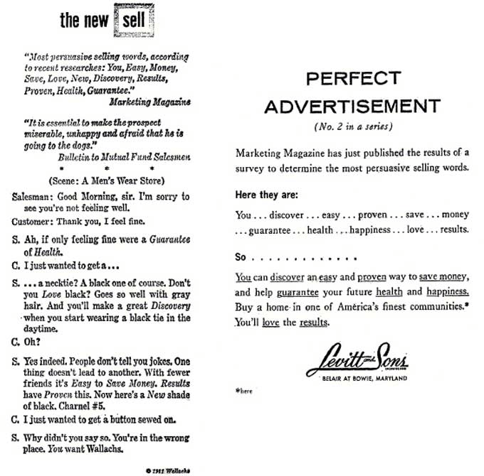
Showcasing he was not the only one thinking about these influential words.
Sometimes however, one word can make all the difference. Research done by Brian Clark of Copyblogger shows how social psychologist Ellen Langer tested the power of a single word in an experiment where she asked to cut in line at a copy machine. She tried three different ways of asking:
- “Excuse me, I have five pages. May I use the Xerox machine?” – 60% said OK
- “Excuse me, I have five pages. May I use the Xerox machine because I’m in a rush?” – 94% said OK
- “Excuse me, I have five pages. May I use the Xerox machine because I have to make some copies?” – 93% said OK
At first, it seems that option two and three are not that different, in the end though version two preformed just a little bit better.
This shows that when creating a high converting CTA, one where people take action, adding a sense of urgency and giving a reason why they should do it is all that matters.
Contrast with the rest of the page, size and position
The final step into nailing your CTA’s into converting machines is making sure that they are standing out as a whole, this can be done by:
- contrast with the rest of the page
- size of the CTA
- positioning on the page
Although all of these three items are different and can have different impacts on your conversion, they are go around the promise of making sure that people can see your CTA. Contrast, size and position can be achieved with all and the same technique though.
Exit intent pop-ups, scrolling boxes, welcome bars, etc. are all different techniques to make your CTA stand out on your pages.
Some great examples
Now you know the theory, let’s look at some examples that are powerful and adhere to the above sets of rules.
Evernote
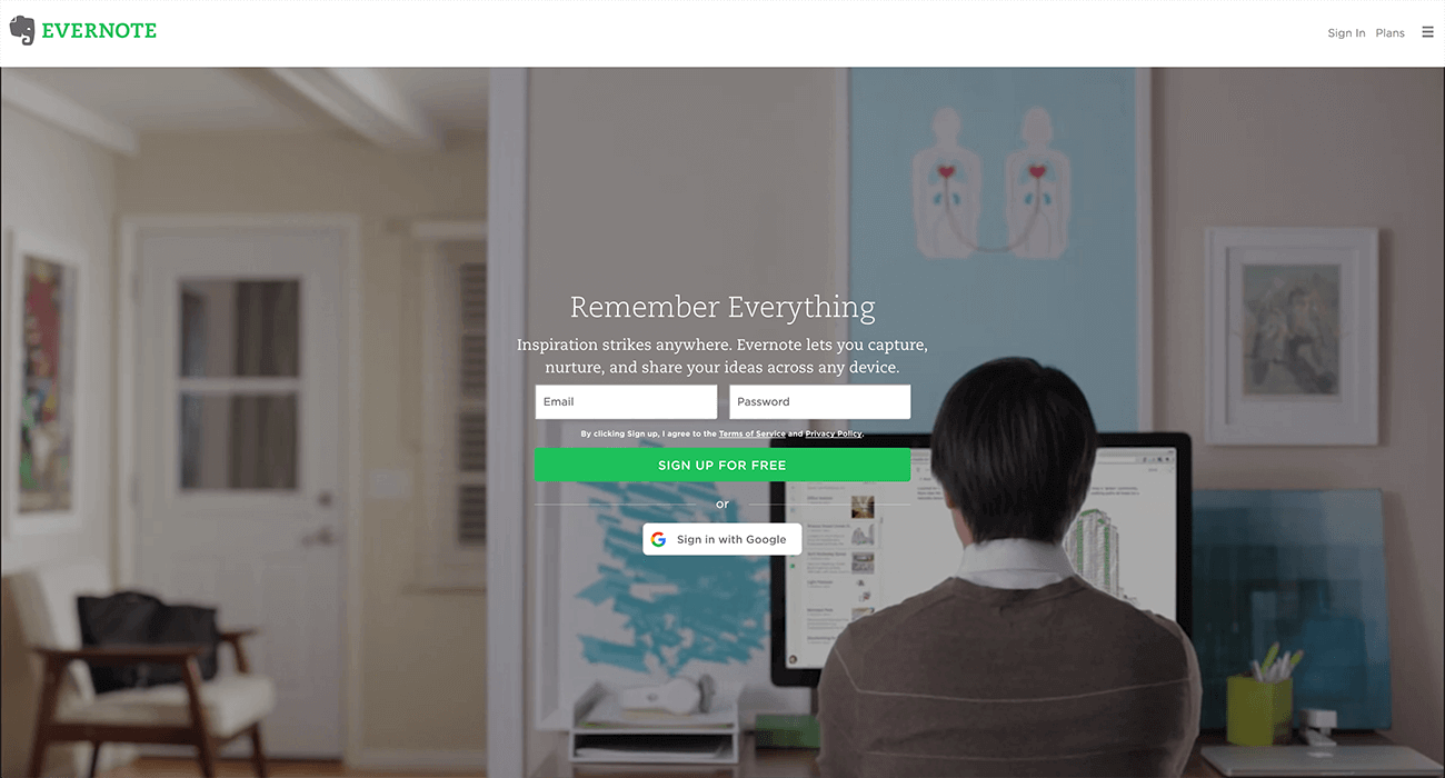
“Remember Everything”
If you arrive on their website for the first time, you immediately get a good understanding of their service offering. The design of the site draws you straight to a super simple form, with all the benefits of the services outlined above it.
The green colour of the CTA button is the same as the logo and pops out of the page. Their focus is on getting signups as you can see and they made sure that everyone who wants to land on their homepage can sign-up with ease.
Quicksprout
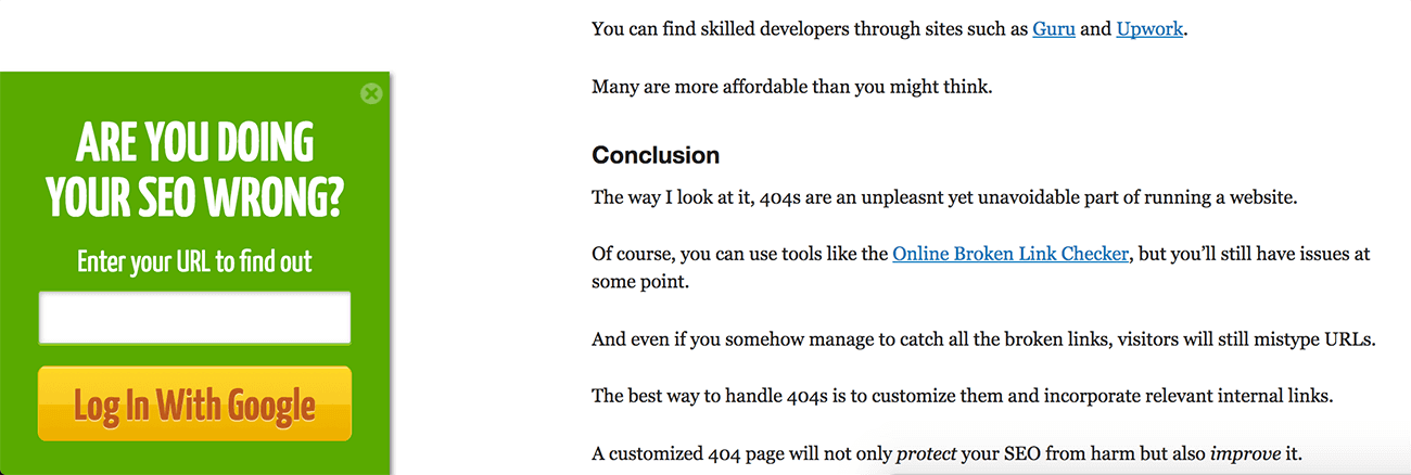
No one wants to be wrong. period. That’s why this CTA on the website sliding in from the bottom is so click-worthy and so powerful. It is asking you “Are you doing your SEO wrong?” This is a question a lot of people are struggling with and right in the target audience of the visitors of QuickSprout.
So yes, of course, you want to find out, and the only think you have to do “enter your URL”. Talking about making life easier for your visitors!
Another thing that is working out great as an attention grabber is the CTA sliding in half-way reading the content. It is an excellent way to catch your reader’s attention before they bounce off the page.
Research shows that 50% of your audience bounces of before the end of the post, so the traditional signup at just the bottom of a post won’t do much good if your readers don’t even get that far. That why sliding boxes are so powerful. (Find out more on how to use Sliding Boxes with Inbound Rocket)
Uber
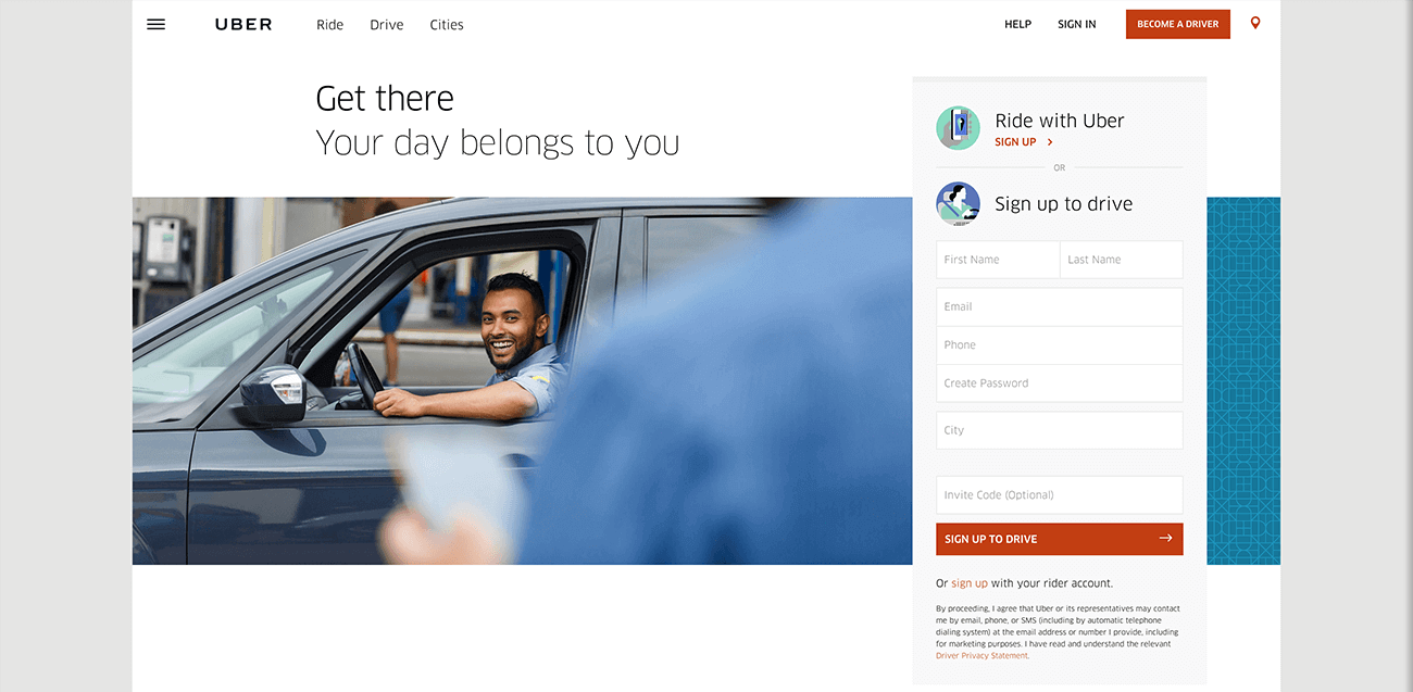
The problem for Uber is that are operating in a “double-sided market”. When someone lands on their website, they could either be someone wanting to take a ride, or someone willing to take people for a ride.
Both sets of Buyer Personas are looking for an entirely different thing.
For Uber the proposition is clear though, people who want a ride are more likely to have the app installed and go on from there. Individuals who want to take others for a ride are more likely to got to their website.
The big picture on the website shows a happy driver, and the tagline above it “Your day belongs to you” could not be more powerful. You can choose on your own time when to start driving and earning money. The forms pops-out nicely on the right, with the CTA-button clearly there in the same red as the “become a driver” in the top right.
Call-To-Actions can be very powerful and lead to great results for you and your company. However, as with everything in life, what works for one company does not have to work for yours.
Test your Call-To-Actions over and over again. Designing tests and implementing different CTA’s across your website are vital. Even if you never created a test before, your CTA’s are a perfect place to start. They are small, easy to implement and the results could be huge for your company. Test placement, colour, style, copy, anything you can think of, test it!
Have you seen other great examples of Call-To-Action across your journey on the web? Leave a comment below and tell us why you think they are so powerful.